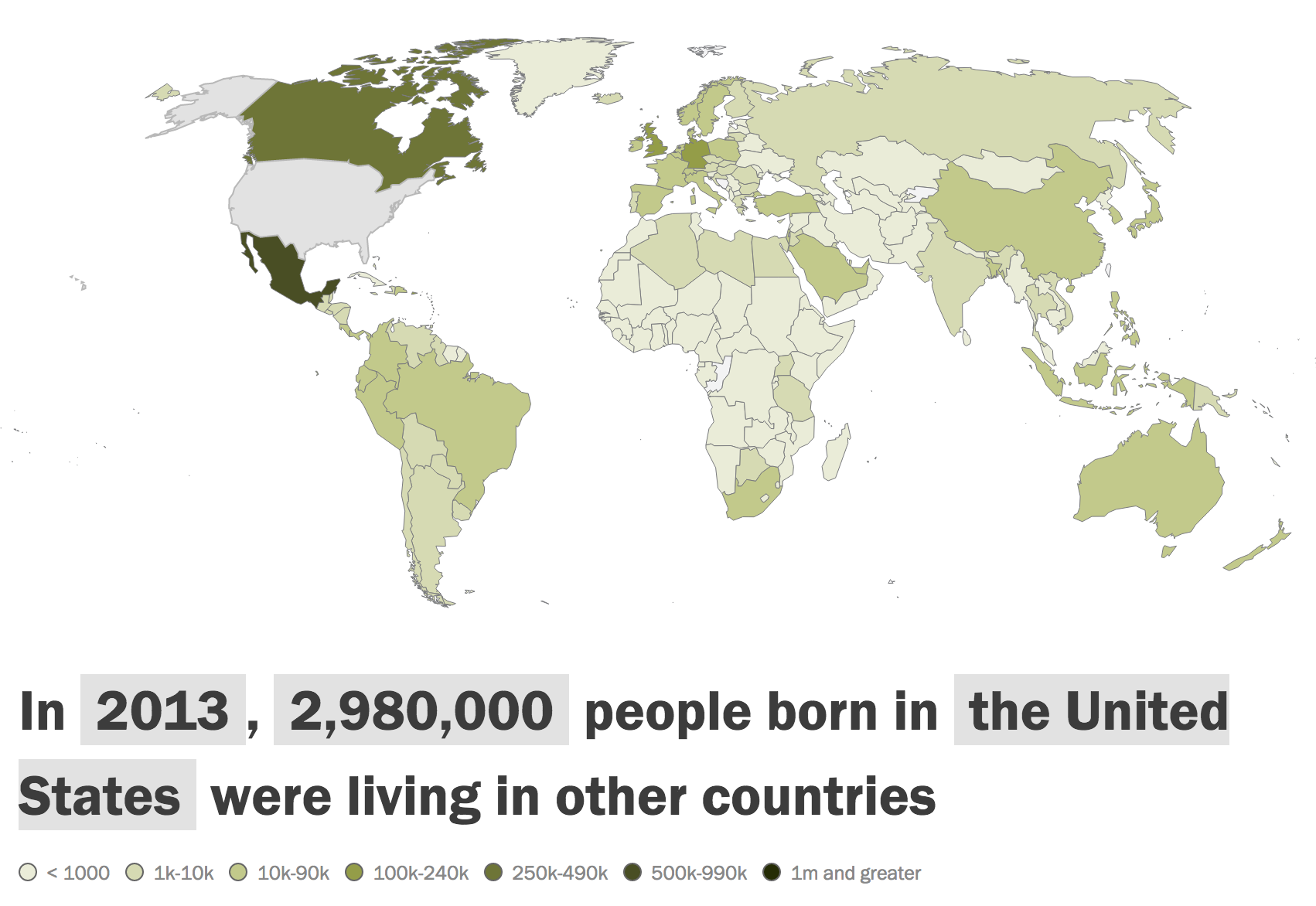
Our 2014 data intern tackled migration flows with U.N. data from 1990 to 2013. The visualization of this would be complex: We had the ability to show the origin of people entering a country and the destinations of those leaving a country – all in four separate years.
Our final product featured a single country snapshot using a heat map of the world and paired this with a table of the data displayed.
One of the impressive things about this project is a positive feedback the Center receives each time it is shared on Facebook. And in social media, positive feedback can be hard to come by.

This project was an evolution of a Feb. 2014 interactive on worldwide remittance data.
